Showing posts with label pink-ish. Show all posts

Thursday, 6 August 2015

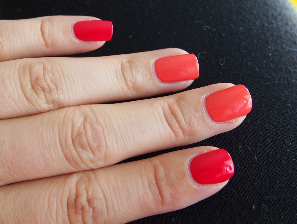
Essie Watermelon and Cute as a button combo

Good evening everyone! Just before I jump to my book and read for a couple of minutes at least, I want to show you a combo I have been wearing for almost a week, before I changed it due to a chipped nail. 

Honestly, I combined Watermelon and Cute as a button because I didn't deem them as my colours, that is to say, colours I would actually like to wear. I fell in love with Watermelon immediately. Cute as a button needed a couple of days but in the end it kind of grew on me. 
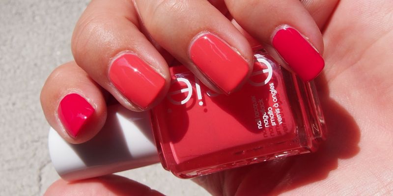


Naturally they were a hell to photograph. Both colours seemed kind of muted on my photos, especially Cute as a button, being a nice lively coral colour IRL. I tried every setting on my camera - some of them were quite fascinating, actually - and this is the closest I could come up to the actual colour. Those of you who have any of them or both will know they are in fact much livelier. I see a lot of wrong swatches of Cute as a button on blogsphere so I guess it is just one of those colours that do not photograph well. I think this is a must for coral colour fans, even I like it, plus the jelly-esque finish gives it the squishiness I really like. It is not a colour I would wear very often, but I can see how this is one of the more popular ones in Essie collection.

Watermelon I adore. I thought it will be too pink for me, but it really is a colour of a ripe watermelon. Yummy. Kind of red, kind of pink, but really neither of the colours. Fantastic colour. 

Watermelon is a two coater and Cute as a button needed three, as it has a bit more jelly like consistency. Both have the new (for me at least) Essie brush that is very wide, but still manageable. 

Love the colours, love the combo, perfect for summer. 


Which shade of Essie is your favourite?


Have a lovely weekend!

~ Ulmiel

*I have received both shades from L'Oreal Slovenija as a gift. This fact, however, does not reflect in my review or opinion of the polish, 

Tuesday, 22 January 2013

Powerpuff Girls set

Heya people! I have been away for a while, thanks to my college work. It does not mean I stopped polishing my nails. :) I have the Powerpuff Girls trio for ya today. I admit, I am a big fan of Powerpuff Girls, I like most of the characters, especially Him and Buttercup and Bubbles. I dislike Blossom, because she is such a smartypants. I generally dislike controlfreak-ish, bossy people. And she is 'the leader'. Oh well.:) 

Hits had come up with an entire Powerpuff girls collection, so I asked the lovely Eveline to get me one for each girl. I chose Cotton Candy from Bubbles line, Elemento X from Buttercup's and Pink Night from Blossom's.


Cotton Candy (the last one) is in fact more pink than purple, but my camera refused to show the real warmth of the shade, on the photos it is much too blue based.
Pink Nights is in fact a neon, yes. My first neon too! I love it. It has a tad bit more pink in the red than my photos show. 
Elemento X is a blackened green that looks black most of the time. You see the flash of green, if you really pay attention to your nails though. 

What all of these have in common is a seriously bad brush. I also tried a Hits holo and it came with the same bad brush, so I guess it is how Hits brushes roll or something. Not an easy application with these, especially with Elemento X, where the bristles are actually so stiff they scrape off the polish already on the nails, when applying a new coat. Formula wise they are all two coaters, but thanks to the brush you have to put three for an even mani. Just a fair warning. Still, I love the theme of these bottles. Powerpuff girls, yay! You know what would be awesome? Dexter's Laboratory and Forster's Home for Imaginary Friends collection! Oh, and Beetlejuice too! Oh oh, and Grim Adventures of Billy and Mandy! Oh man, that would be so cool. :)

Do you like Powerpuff girls? How about Hits polish?

Thank you for reading!

Saturday, 24 November 2012

Penélope's Lotus with Zoya's Lotus

Evening my dear people! How are you doing? I trust you USA gals are having a wonderful holiday! I'm feeling a bit under the weather. My ear is starting to ache and I dread the pain, because I had earache very often as a child and I loathe it. I think that is one of the worst type of pain a person can get. Hopefully it is nothing serious and it will pass soon. 

Today I have two gorgeous colours for you. I'm sure you all know Zoya Lotus, from Zoya True collection for Spring 2012. It is a lovely, smoky purple with pinkish shimmer. Of course it turns a bit too blue on my photos. I'm starting to see the pattern with these types of purples and my camera. It is a lovely polish, I love it.
I decided Lotus would be a great base for another Lotus. Penélope Luz is, as far as I understand, a Brazilian indie brand. And oh, Lord of the Rings, are those babies gorgeous!!! Lotus caught my eye the moment I unwrapped it. It is such an amazing glitter. It consist of black, white and pink round glitter, and there is a very generous amount of it in the clear base. I think you could easily built up Lotus with three or four coats. Here is how it looks like in two coats over Zoya Lotus.


And the best colour accurate photos I got of Zoya Lotus:


Penélope Luz Lotus looks even more stunning IRL. I love it. Plus the base is a bit less blue so it compliments the glitter more than on these lightbox pictures. Penélope Luz has a Facebook page and you can buy it of Loja BBF page. Fair warning: after seeing pictures on the FB page I built up a wish list of Penélope Luz wonderful creations (just check Ocean Jewel, Wicca, Geisha, Wedding Dress and Gitana out!). If they are half as amazing as Lotus is, I need to get them somehow. Remember them on Brazilian swapping! I can only thank Eveline for surprising me with it, Lotus is amazing, dear, thank you!!

Do you know Penélope Luz brand, have any of her nail polish?

Thank you for reading!

Monday, 29 October 2012

Zoya ~ Kimber

Hi there! As seen in my previous post, I got my Zoya mode on. The response surprised me a bit, thanks for the lovely feedback! :) You asked for Tru, Lotus and Kimber, and they will be shown ASAP. As it happens, I wore Zoya Kimber right after Skylar (the first one I tried but didn't have time to make photos of it, believe it or not, probably the first time since I'm blogging). Kimber was chosen by my BF, to my great surprise. He usually prefers dark reds and vampy colours. 

Kimber is a warm pink base with golden shimmer, similar to China Glaze Ahoy!, also in the fact that in the artificial light it warms to pink red, that I adore. They also turn too pink in my lightbox. But yes, Kimber is a perfect nail polish for these winter days in October, to make them a bit brighter. I love Autumn, so I hope lady Winter will give us a few weeks more of it. I did natural light photos in extremely gloomy weather, sorry about that. The details are gone, but the base colour is accurate.


The formula on this baby is superb, very easy application. Three coats, I dislike VNL, as you know. Kimber is a part of Zoya Surf Collection for Summer 2012. I got 5 out of 6 in the Surf collection. Whoop! I love wearing Kimber, it's a cheerful colour, very rich too. If you're interested in comparison with Ahoy!, let me know in comments. :)

Do you like these kind of colours? Which ones were your pick in Surf collection?

Thank you for reading!

Wednesday, 8 August 2012

Take two on China Glaze

Heya people! How are you doing? I put on China Glaze Watermelon Rind again today and remembered I wanted to redo the swatches of it. Then I saw I already posted them and they are, in short, horrible. As I scrolled down my China Glaze label I also noticed my Bad Landing and Orange Marmalade swatches probably convince you not to buy them and not vice versa. Luckily I took a few shots of each when I wore them this Summer, so here is my take two on all three of them, in hope of doing them a little more justice, for they are awesome, especially Orange Marmalade and Watermelon Rind being my favourite China Glazes. 


Watermelon Rind. A green/blue/teal glass flecks. How gorgeous is that. This polish is incredible, really. If I had to hold on to just one China Glaze in my stash, this would probably be it. It contains everything I hold dearest in a nail polish. Yes, it's sheer, but with glass-flecked finish I'm willing to look past that. The formula was great, I had no troubles today with the application, so the extra coats weren't time consuming. 


Orange Marmalade is the orange sister of Watermelon Rind, the orange glass-fleck of the Summer Days collection that China Glaze released in 2009. I still don't think I did this amazing orange justice, but you can see how it glows and just how bright it is. And juicy, I always crave orange juice when I see it, hehe. Again a great application. Every time I wear these two I remember why I want the entire Summer Days collection. Glass-flecked finish at its finest, and you know how much I love that finish! 


Bad Landing. When I wore this for the first time, Tevta lent me her China Glaze collection. The second time I wore it, it was already mine, because Tevta hated it and gave it to me. I still love it, I have no idea what I love so much about this polish. Probably that it is so insanely bright (my pictures don't show that correctly). Or that it shifts from red to orange to pink, depends on the light. It's a cool colour, I like it. :) I can't find if Bad Landing was a part of a collection, so I'm guessing it wasn't. Oh, the application is superb, I don't think I needed clean up with this one at all.

Well, I don't know about you, but I think my new swatches are much much better than my old one. Finally figured out my nail shape, my hand position when taking photos etc. Bloggers, ever redo your swatches simply because it bothers you that you have a set of bad ones on blog? :)

What's your favourite China Glaze polish? Ok, top three? ;)

Thank you for reading!

Tuesday, 24 April 2012

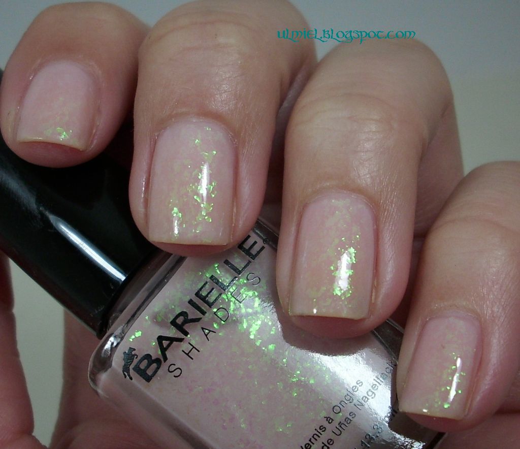
Barielle - Buddha-ful (a.k.a Luna Lovegood polish)

Heya people! How are you doing? I'm enjoying my cup of coffee after my lunch and I think it's about time I show you this beauty. Buddha-ful got the most 'votes' or rather wishes to be seen first in the last package I got, so I'm showing it first too. I was curious about how we'll get along, being a very gentle colour that I don't usually wear, and still intriguing me from the bottle. I went through the blogsphere, trying to figure out whether to layer it or build it up and then I decided to build it up, since I wanted to have the bottle colour on my nails. 

I'm wearing it ATM and after two days I'm still loving it. I knew this will be the colour I'll either love or remove after an hour of wearing and as it seems, it is a major win in my book. It's unusual. Unique flakie.Of course I don't have anything near the colour in my stash yet. It's hard not to stare at your nails, the soft rose/beige base colour making your hands so gentle and elegant and the green-blue flakies providing the twist for the gentleness, making it a bit weird. 
I understand the connection with Buddha and the esoteric feeling this colour gives you when you're looking at it, but the first thing I thought of when my mani was complete was one strange and cute little witch, Luna Lovegood. From Harry Potter books, of course. Luna is very gentle, sweet and at the same time very unique and strange person. One of my favourite characters from the HP world, I love that girl. And I think the weird combination of soft beige base colour and green flakies would be a nice polish to make for Luna in Harry Potter nail polish collection. Yes, I had an idea of making it, 12 bottle collection, I'd go big. :D

Pictures!


The only way I could capture the blue shift of flakies is this rather bad photo, I'm afraid.

Alas my camera wasn't made to capture such details correctly. You'll just have to take my word for it, the flakies are much more visible IRL and the green-blue change isn't so hard to see with the naked eye. Still, most of the time flakies are green and i think that suits this polish just fine. I made a million photos and even a video,  and this is the best I could come up with. 

Buddha-ful is a part of Barielle Karma Collection for Summer 2011, a collection that does have some nice colours, but Buddha-ful is by far the most unique. On the pictures I have 4 thin coats, I payed special attention to not flooding my nails with too much polish, making them 'fat' as I call it. With four coats it builds very nicely. Three would be enough if you don't mind VNL. I think I'd have VNL with four too, if my nails were longer, but now I basically don't. I love how this polish builds, the base colour is sheer enough so the flakies look layered. You can also layer it but I don't like the milky touch the base colour gives to the mani if it is layered over a dark colour, so I decided against it.When my nails will be longer I'll probably layer it over a total nude, so it won't show.
The brush and formula were great too. This is my first Barielle, so I was curious about that. :)

Buddha-ful is a gorgeous polish. Very unique. I'm very positively surprised by it. :) How about you?

Thank you for reading!

Sunday, 30 October 2011

Nail polish blogger Challenge day 7

Hello! It's Sunday, but it's not the end of the weekend for me, woohoo! Two extra free days! And it feels goood! :P It's the last day of the challenge ... I hope you had fun with it, or at least found it a little bit interesting. :) As for my part ... I loved how it pushed me to do more art work. I did serious stamping for the first time, i did dot manicure for the first time and I had tons of fun making up new manis and combinations. So it's a good thing! The only thing I had problem with was the time. I just don't have so much time as I used to for blogging, it sucks. But I love a good reason for thinking up new ideas, so the challenge has been awesome. And challenging with a colour I don't normally wear. At all, let alone for so many combinations. Pink is out of the box for me. Or going inside the box when I'm mostly out of it? Haha xD Anyway ... this was a pink that actually grew on me, but I need a serious break from pink now. :D But i discovered some awesome combos. My favourite mani of the week was the one with Deborah Milano layering, I'll do that one again for sure. And the flakies, of course, but what else is new.

I loved my flakie mani (day 6) so much, I decided I'll built from that. I mattefied it with Essence Matt Top Coat and then I decided I'll do some serious scotch taping. And I went to my favourite accent finger style, diagonal stripes. Of course I failed miserabily at attempt to make them all at the same angle, but I like it anyway. :) The top colour is Catrice Plum Play With Me. I don't recommend it for this kind of work, it needs two coats to be opaque enough and the coats need to be really thick, which can result, as you can see on my ring finger, in bubbling. Still, hell, I like it!


Mattefied flakies. I don't normally like it, but I wanted them to really pop out on this rather bright base colour, and matte TC makes them more yellow. :)


What do you think about this combination? Which of the manicures of this challenge did you like the most?

Thank you for reading & don't forget to check the others too. Ladies, it's been fun! :)

Saturday, 29 October 2011

Nail polish blogger Challenge day 6

Hey darlings! Welcome new people! :) How is life? Mine ... hectic but fun. Due to the hectic part I'll need to make this extra short again, which kinda bothers me, for some odd reason I prefer to make my posts more personal than this. But here we go ... I knew I'll do a mani with Nfu Oh flakies since the beginning of the challenge, I just think they're the perfect option for making the mani more interesting. I left it until the final days, since I suspected I'll want to build it for another mani and I did. But I didn't want to ruin the combination because I really loved it. Mind you, it looks TONS better IRL. Seriously. Especially since Give Pink A Chance darkens a bit in yellow artificial light and flakies really pop out. Love it. The pictures, sadly don't do this combo justice.

Finger Paints Give Pink A Chance (three coats) with two coats of Nfu Oh 49.


The flakies are much more visible IRL. Sorry I can't show you this, but the weather is just unbearable here, if I didn't have my lightbox I wouldn't be able to make a decent picture for a week now. 

What do you think of this combo? I got pretty far for an ex not-a-flakie-fan, eh? ;)

Thank you for reading, check the other participants of the challenge too!

Thursday, 27 October 2011

Nail polish blogger Challenge day 4

Hey guys! Today I'll be quick, I don't have much time, I'm working on another project, I'm really excited about it, I'm planing to show it to you too. :) So now our fourth day of pink challenge. I'm glad you liked my yesterday's mani, I liked it too! But this one just might be my favourite, I loved how it turned out.

I layered Deborah Milano Pret a Porter Purple Batik over my base colour Give Pink A Chance (Finger Paints) and I used simple scotch tape design on my ring finger. I think it turned out pretty sweet. :) I love the glass flecked almost duo chrome look Purple Batik gives to the whole mani. 


Like I said, I like it! How about you?

Thank you for reading and don't forget to check other creations in this challenge:


Wednesday, 26 October 2011

Nail polish blogger Challenge day 3

Heya darlings! Another day, another combination for the challenge! This one is kinda special. Because it's my first real attempt at stamping. I got the chance thanks to Born Pretty Store who kindly sent me a Bundle monster plate for a review that i have yet to post, but I will, I promise! I actually love how this turned out. 
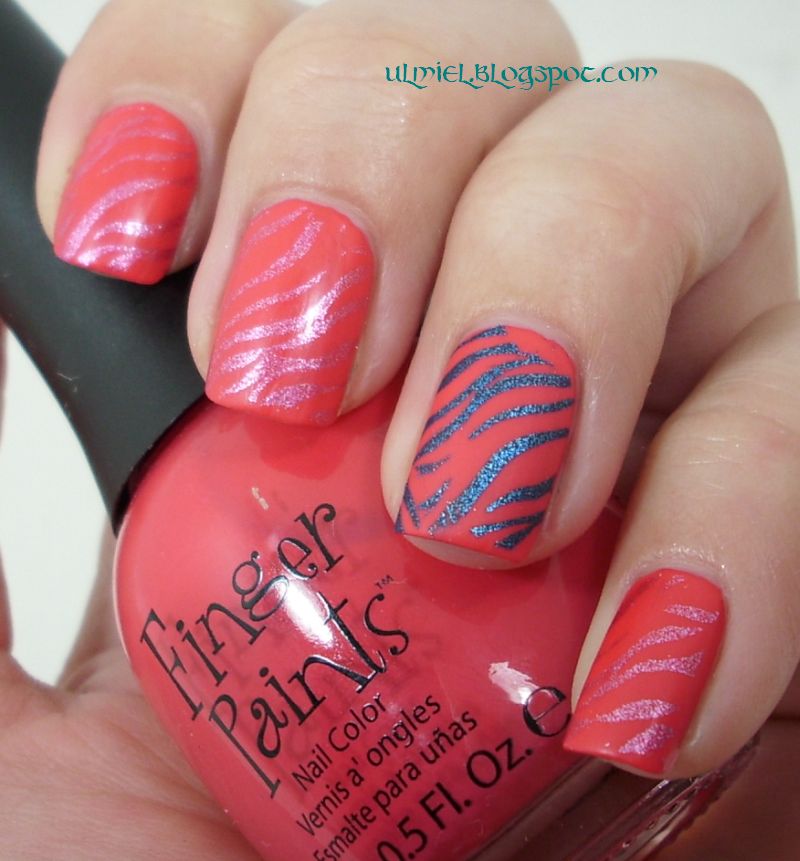
I'll try to do an accent mani in these posts too, so my ring finger will tend to be a bit different from the rest. Here is the same. I used Color Club Hot Like Lava for stamping on most of my finger and Color Club Cold Metal on my accent finger. Then I mattefied the whole thing with Essence Matt Top Coat and I love how it looks. Pictures!

 See how the pattern still shines due to the foil finish of Color Clubs? Love it!


And how it looked before getting mattefied ...


As you can see, I have miles to go before I get the stamping thing. My lines were not perfect at all and it bothered me quite a bit, but then it sort of grew on me with the imperfections and all. Sure, some just might call it sloppy work. We live and learn.

What do you think about this one? 

Thank you for reading & check the art of other lovely participants: